5 Common Mistakes To Avoid On Nudist Websites
It should be no secret that nudists aren’t exactly a tech-savvy group when it comes to using the internet. As we’ve said before, it’s like the mainstream is doing apps and email and social media while modern nudism is still writing letters.
Many nudist websites look like Internet fossils that were made during the dial-up days of the internet. They’re a sad mish mosh of ugly colors, patterned backgrounds and 90’s graphics. And on top of all that, they’re often difficult to use or navigate.
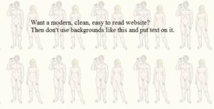
Sadder still, some clubs and nudist businesses think their poorly designed site is just great as it is. (If you’re a club member who realizes it’s bad, you should tell them it’s bad.)
In 2017, you really can’t downplay the importance of having a clean, modern, informational and functional website.
There are a lot of different site problems we could get into, but here we’ve come up with 5 big of the bigger mistakes being made on nudist websites.
We hope it will inspire some nudists to make changes and improve their online appearance. And if you need help – we actually offer website design, optimization (if you don’t know what this or the term SEO means, then you need help), networking and social media at very affordable rates. Just get in touch with us!
1. Your website is a time capsule from the 90’s.
Has your website kept its original look from 1996? Is it a HTML site with dopey gif pictures on it? Time. To. Upgrade!!!! (And please get rid of those dopey gifs as they make us all look bad. The examples below are taken from different nudist websites.)

![]()
![]()


Your website is the face of your business. It’s the first impression people will get about you. In most cases, its the first point of contact. Having a site that’s ugly, outdated, clunky and difficult to navigate is really not going to make anyone want to visit or engage your services.
Moreover, having an outdated platform is going to make it much more difficult for you to rank in search engine results. At YNA we have resort review blogs that rank higher than the resort’s own website. At least we are getting the word out on their behalf, but in all honesty, your website should show up #1 when people search for you online. And if it’s not even showing up in the top 10 results, you’re really doing something wrong!
2. You have a “nudity” / “adult content” / “18+” warning pop up before people can view your site.
Naturist websites should not have this kind of warning on them. For one thing, it’s reinforcing the idea that simple nudity is shameful and dirty.

Second, if you agree that naturism is appropriate for kids and simple nudity is not harmful to children, your website warning is sending the opposite message. Even if you did think that kids shouldn’t be seeing nudity, this warning isn’t going to do much to prevent that, and a kid browsing the internet has likely already seen porn. (This is a sad fact. As we’ve previously discussed in regards to pornography research, it’s been shown that kids as young as 11 are accidentally seeing porn online while doing homework.)
Third, the warning pop-up or page is going to increase your bounce rate (users who visit and immediately leave) and probably hurt your search engine rank (as well as hinder the search engines’ ability to crawl your site effectively!).
Some nudist clubs are under the mistaken impression that they are legally required to have a warning, but this is not true. There are no laws about this. (Even porn sites are not required to do this and the ones that do are voluntarily putting up their 18+ adult content warnings.)
3. You have very few photos of your club and / or your photos are really bad and / or have zero people in them.
If you own a nudist club or resort, wouldn’t you want to show off your place as best you can on your website to entice people to visit??
Based on what I’ve seen, many nudists don’t follow this train of logic. I’ve seen websites that only show a few very small, low-res photos or have no people in them at all. Or they’ve made the puzzling decision to use bad stock photography or photos that seem to feature only attractive female models.
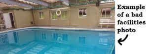
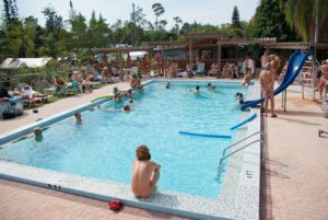
Or, one of my personal pet peeves, they have photos of their facilities that were taken on a gray, cloudy day. Why, oh why?
Get a few volunteers, get someone who knows how to use a camera (or hire YNA) to take some better pictures on a clear sunny day!
4. Not posting any information to your website about your own events.
This would seem like more common sense, and yet so many nudist clubs and resorts make it difficult to find information about their events. Many clubs will have an events calendar or a list of their events with dates, but the title and date is all you get. How is this supposed to lead to greater attendance to ANYTHING???
I just don’t understand this. I really, really don’t.

I’m not even asking for a full, detailed, enticing event description (which is always great to have). Even providing just the most basic details would be an improvement.
If you’re doing a big event (like anything more involved than a potluck), you should have one separate page all about that event. It should have some relevant images or a flier. (Please note that a flier alone is not enough. For several reasons, event details should be always be written out even if it includes the same basic information as your flier.)
5. You have a glitchy website.
Does your site bring up an error before it loads? Have a non-functioning contact form? Links that lead to dead pages or don’t work?

All of these types of issues are going to frustrate the user trying to navigate your site and leave them with a bad impression of you. It’s also going to negatively affect your site traffic and search engine rank.
Don’t rely on visitors or users to tell you about glitches or broken links. Click around your own website to test functionality, and use online tools such as Google webmaster tools to find broken links and other issues within your site.
Stay tuned for a part 2 with a list of more ways to improve your nudist website!

